A recruitment website with two clear audiences and one coherent identity. Editorial type, portrait imagery and visible job details guide employers and candidates towards different next steps.
Project scope
- Website design
- Employer and candidate journeys
- Job listing presentation
- Sector navigation
- Mobile layouts
The idea
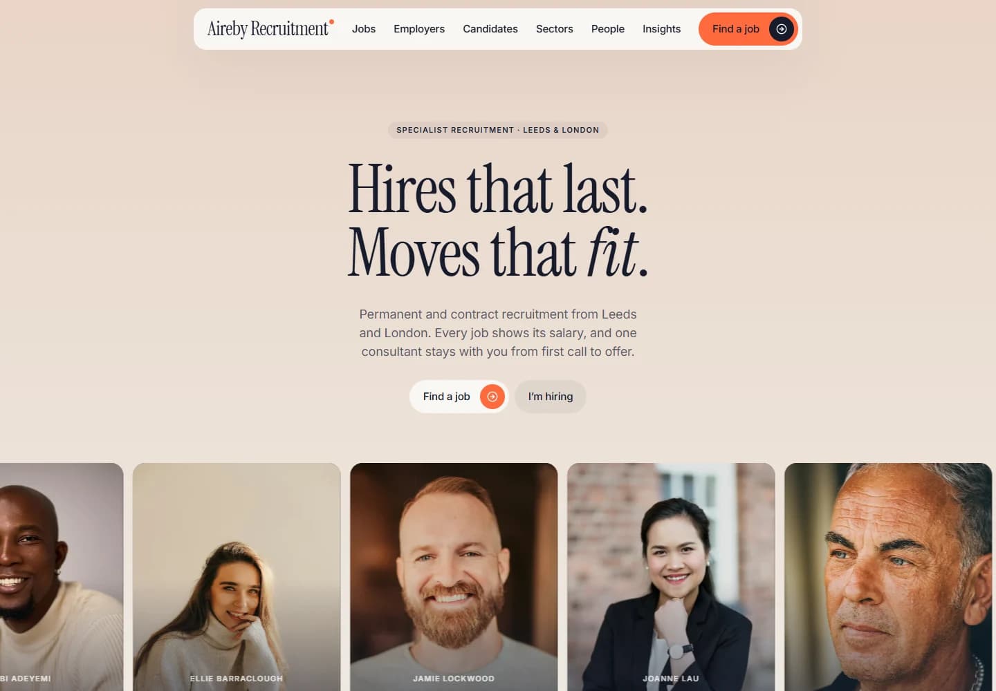
Recruitment websites often ask two very different audiences to share the same page. Aireby makes the distinction early: one route for hiring, another for finding a role. The copy focuses on understandable details such as a named consultant, a written brief and salary information rather than broad corporate language.
Design direction
A warm peach background and tall serif headline give the opening an editorial character. The portrait strip brings people into the design without crowding the central message. Orange details highlight important controls, while the navigation gives jobs, employers and candidates their own places.
The visitor journey
The first choices lead into separate employer and candidate content. Job cards show roles and salary context, while sector links let visitors narrow their search. The process section explains the stages around a brief, shortlist, interview and offer, giving employers a view of the proposed working relationship.
Design review
The audience split is the most important decision in this project. It makes the site easier to navigate before any filtering or detailed reading is needed. The human imagery and distinctive typography then give that practical structure a character of its own.
A closer look
Considered at every size.
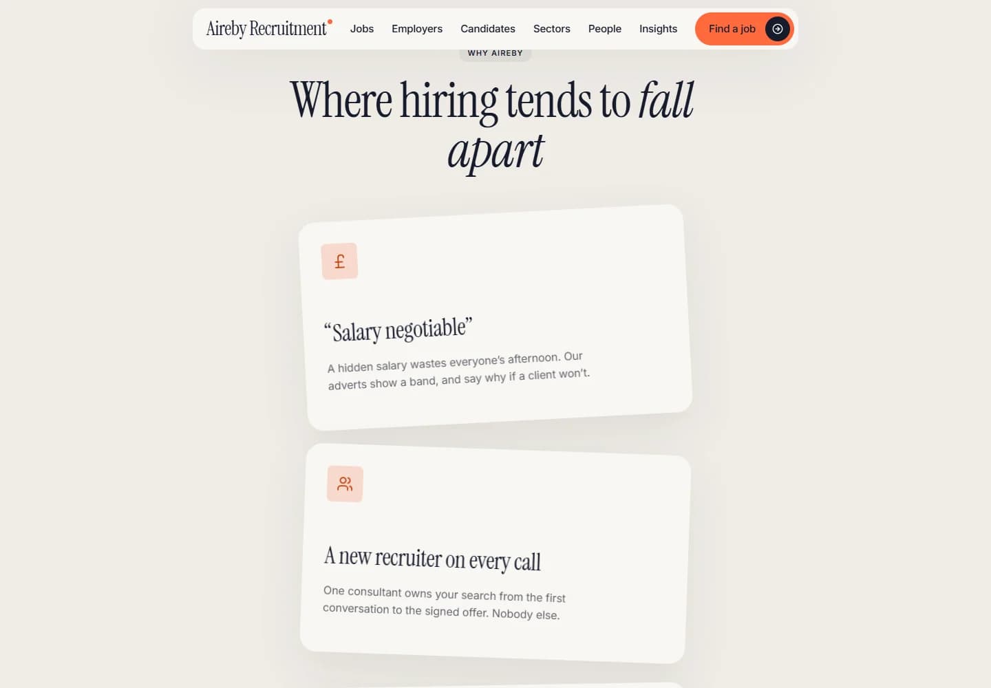
Desktop · A closer look at the content
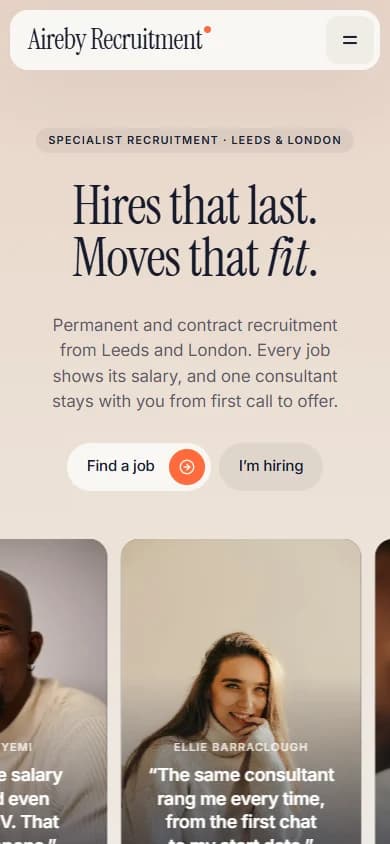
Mobile · The first impression
Your next website