A high-contrast boxing and fitness website with the energy of a real training space. Strong photography, clear class choices and straightforward package information keep the design focused on getting started.
Project scope
- Website design
- Class presentation
- Package comparison
- Location information
- Booking pathways

The idea
A gym website should convey the atmosphere of the place and explain how to join in. Slipworth combines those two jobs. It leads with training imagery, then introduces boxing, resistance and circuit sessions alongside packages and the two Bristol locations shown in the demo.
Design direction
Black-and-white photography, condensed headings and red highlights create a strong sporting identity. The hero gives the training image plenty of space, with a short message and a clear booking control. The navigation sits lightly over the photograph rather than competing with it.
The visitor journey
Visitors can move from the opening straight to booking or compare the class options first. Session descriptions explain the kind of training involved, while package and location sections address the practical choices. The coach introduction adds a personal element between the more transactional parts of the page.
Design review
The visual direction feels consistent with the activity it presents. More importantly, it makes room for details a new member needs: class format, package options and where to train. That combination gives the page substance beyond a dramatic opening image.
A closer look
Considered at every size.
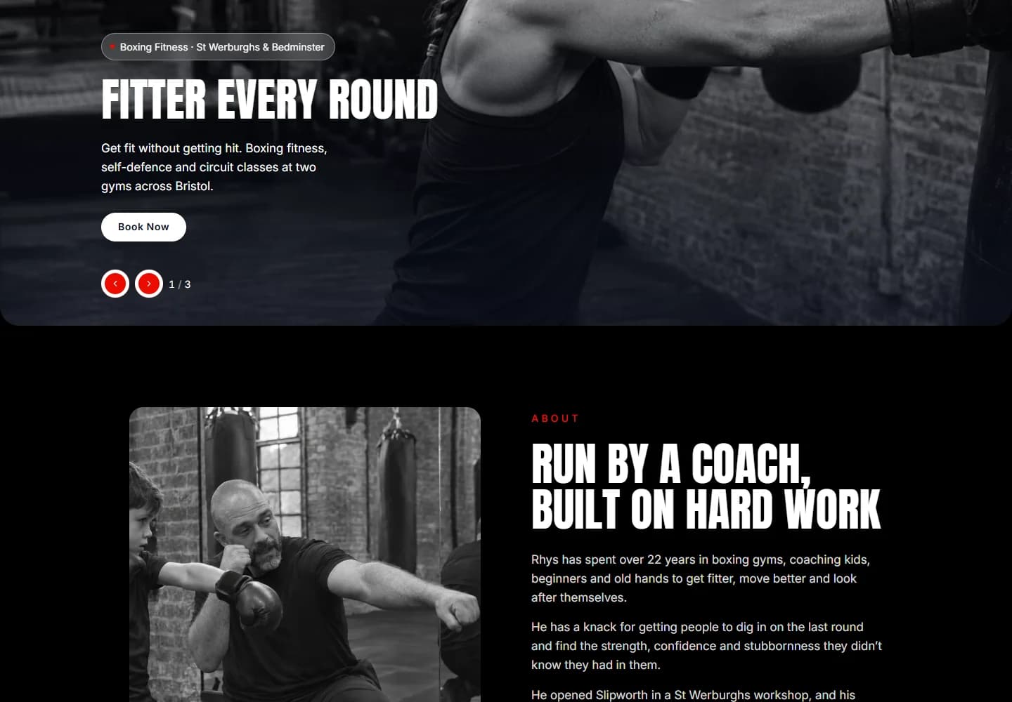
Desktop · A closer look at the content
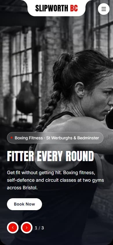
Mobile · The first impression
Your next website