A bold plumbing website that puts the next step within reach. Service information, local coverage and booking routes come together around a practical, people-first design.
Project scope
- Website design
- Service navigation
- Booking pathways
- Membership presentation
- Mobile layouts
The idea
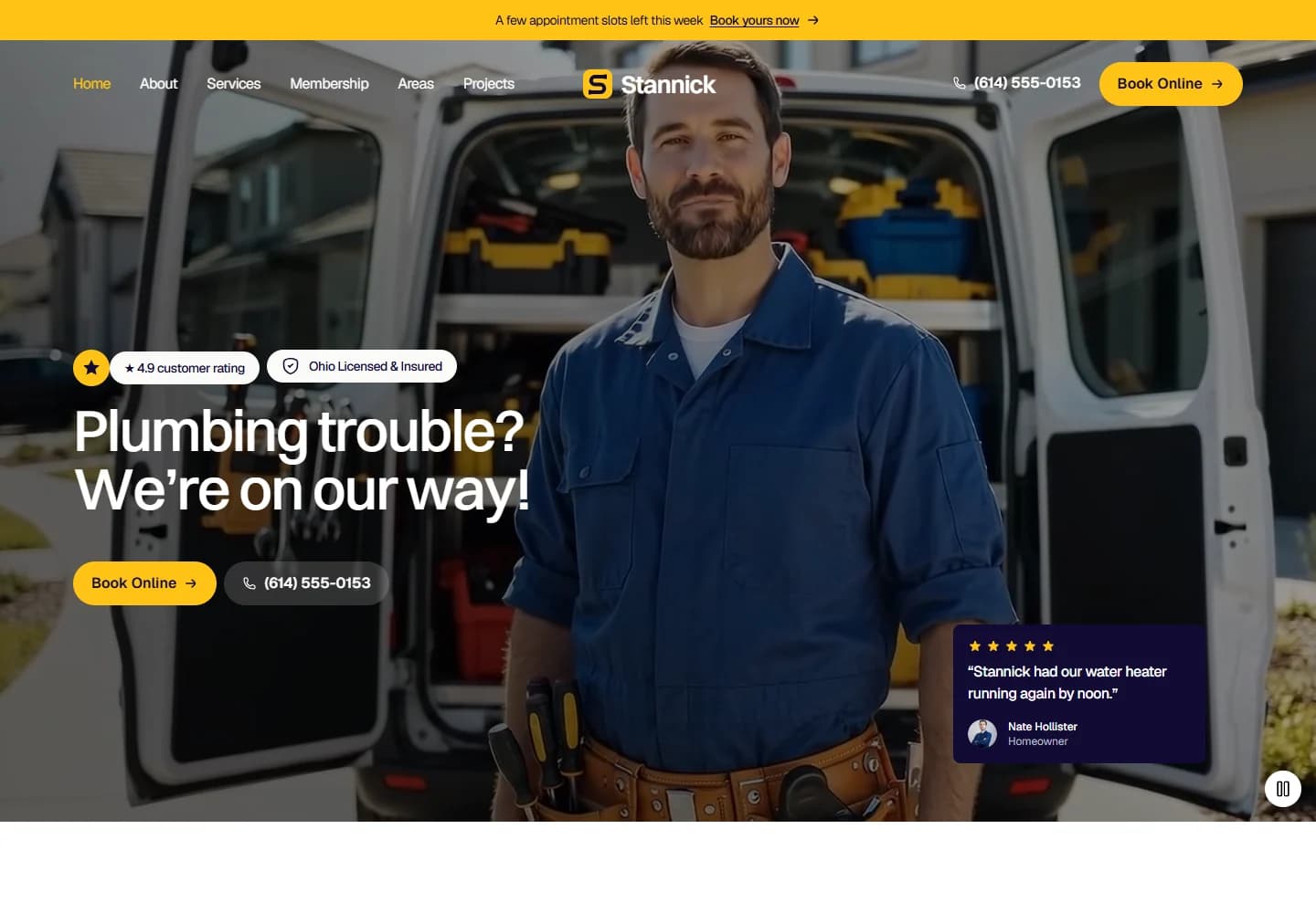
When a pipe leaks, nobody wants to work through a complicated website. Stannick is built around that simple situation: explain what help is available, make the business feel approachable, and keep a phone call or booking close by. The site brings repairs, water heaters and other plumbing services into one clear starting point.
Design direction
Bright yellow accents give the page a recognisable identity against dark photography. The opening image shows the person and tools behind the service, while a short headline keeps the first screen focused. Rounded controls and readable service cards soften an otherwise bold layout.
The visitor journey
Visitors can call straight from the introduction or explore a specific service before deciding. Further down, the process breaks a job into manageable steps. Coverage, project examples and the membership section give less urgent visitors reasons to keep exploring without losing the booking route.
Design review
The strongest part is the balance between urgency and explanation. A homeowner with an immediate problem gets a direct route to help; someone planning maintenance can take their time. The yellow accent is doing a useful job throughout: it makes the important actions easy to pick out.
A closer look
Considered at every size.
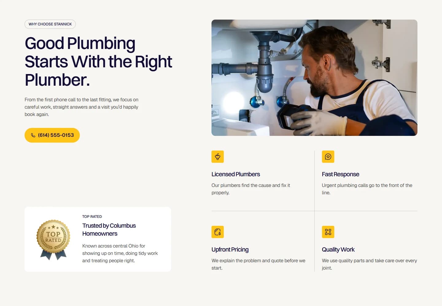
Desktop · A closer look at the content
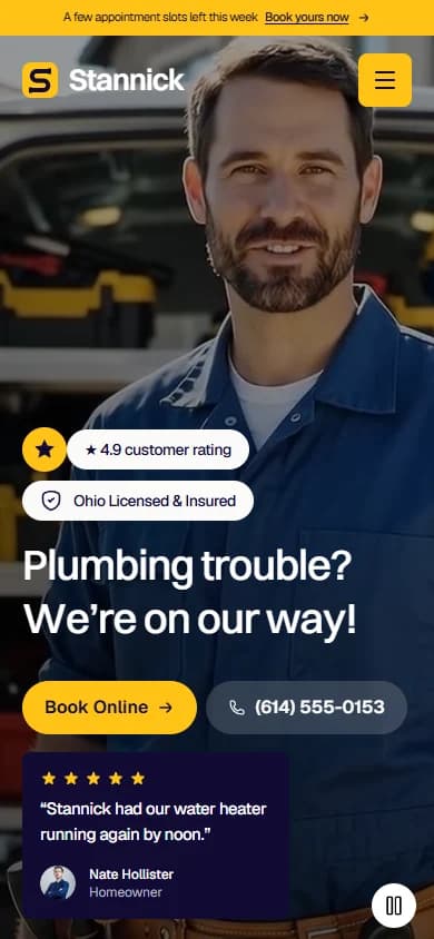
Mobile · The first impression
Your next website