A bright, direct air-conditioning website designed around home comfort. Clear service cards and contrasting booking controls help visitors move from a cooling problem to the right enquiry.
Project scope
- Website design
- HVAC service catalogue
- Contact pathways
- Local service messaging
- Mobile layouts
The idea
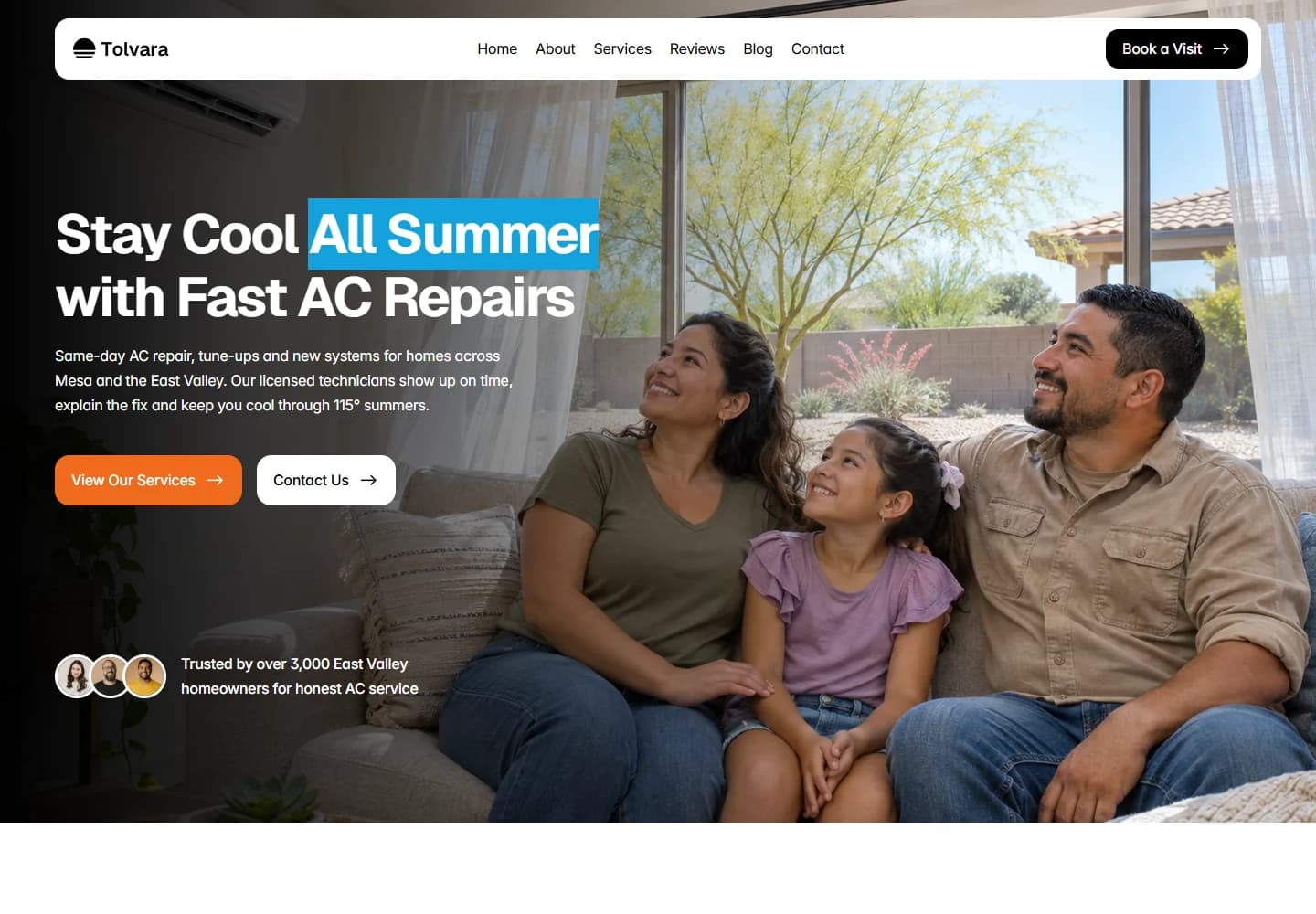
An air-conditioning website needs to work for both an urgent repair and a planned installation. Tolvara makes the service easy to recognise from the first screen, then gives the visitor a choice between exploring the offer and making contact. The content is organised around the cooling needs of homes in the Mesa area.
Design direction
The hero uses a family at home rather than a close-up of equipment. A blue highlight draws attention to the headline, while orange marks the main action. A floating white navigation bar and generous image area keep the introduction clear even with a strong photographic background.
The visitor journey
Service cards divide repairs, installation, maintenance, refrigerant work, coil cleaning and inspections into separate entry points. Visitors can browse those options before reaching the supporting information and contact section. The page gives planned maintenance space alongside more immediate repair enquiries.
Design review
The design connects the technical service to the reason someone needs it: a comfortable home. It also keeps the two main visitor intentions visible. The contrasting colours make the page lively, but the simple service structure is what gives the layout its practical value.
A closer look
Considered at every size.
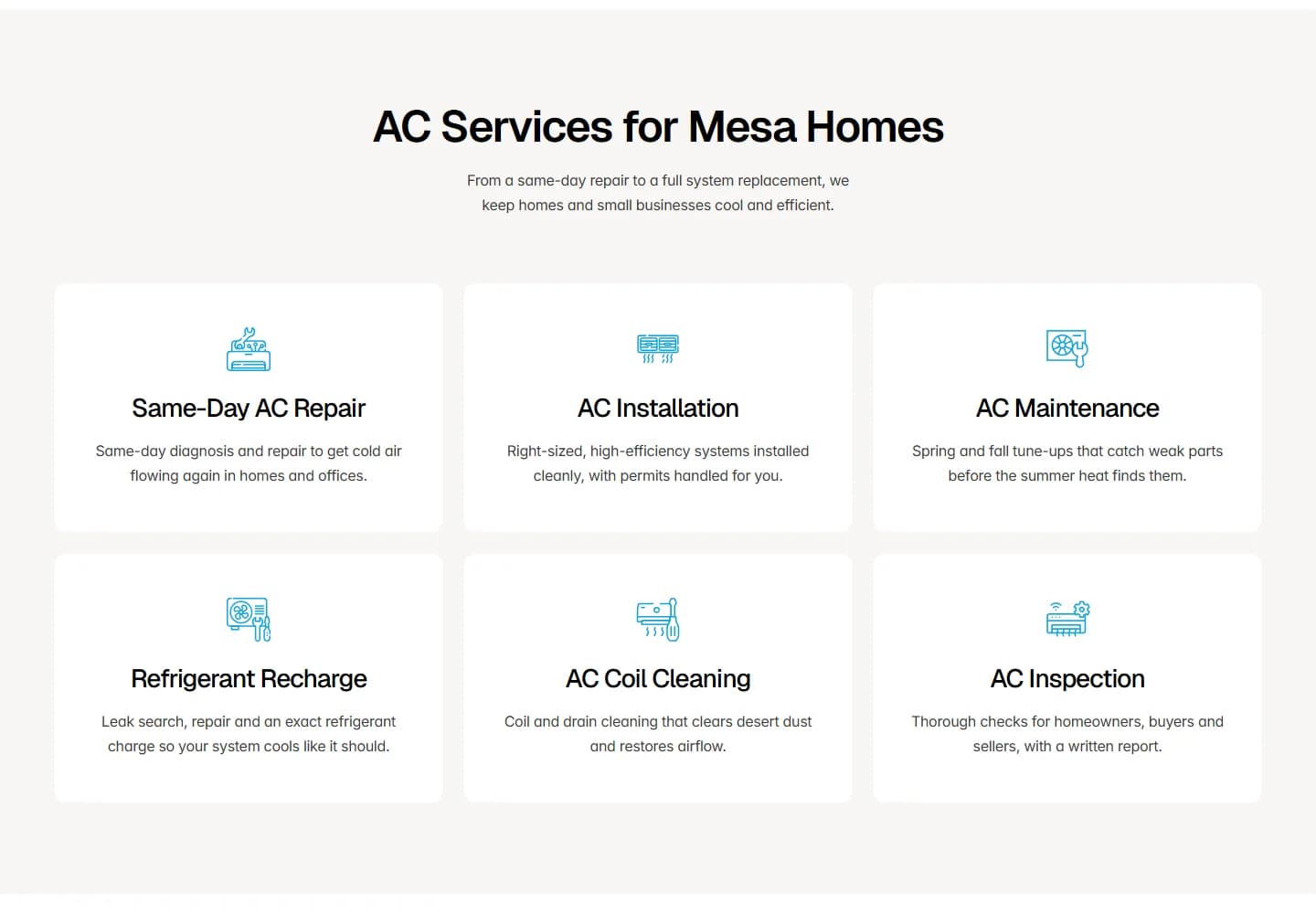
Desktop · A closer look at the content
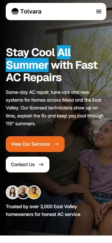
Mobile · The first impression
Your next website