A dental website with a warm, reassuring first impression. Treatment categories, specialist profiles and clinic information support a clear path toward an initial consultation.
Project scope
- Website design
- Treatment navigation
- Specialist profiles
- Clinic presentation
- Consultation pathways
The idea
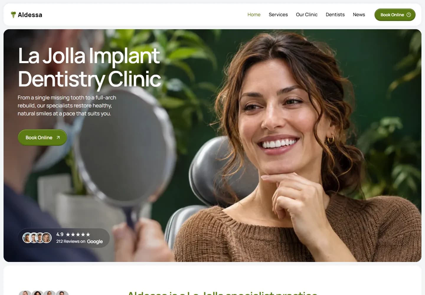
Choosing implant treatment is a considered decision. Aldessa makes room for that by introducing the clinic, the people and the treatment options before asking visitors to take the next step. The focus is on a comfortable reading experience and a clear consultation route rather than a crowded medical brochure.
Design direction
Olive green details and large, rounded image panels give the site a softer character. The hero focuses on a patient looking in a mirror, which places the experience ahead of clinical equipment. Short content blocks and open space allow the treatment information to feel less intimidating.
The visitor journey
The navigation separates services, the clinic and dentists so visitors can approach the decision from different angles. Treatment cards group implants, veneers, prosthetics and routine care into recognisable options. Clinic details and specialist profiles sit alongside consultation calls to action instead of being buried at the end.
Design review
The strongest choice is the emphasis on people. The photography and profile sections give the site a personal rhythm, while the treatment structure keeps it useful. It is a good example of giving a specialist practice a distinct identity without letting visual effects compete with important information.
A closer look
Considered at every size.
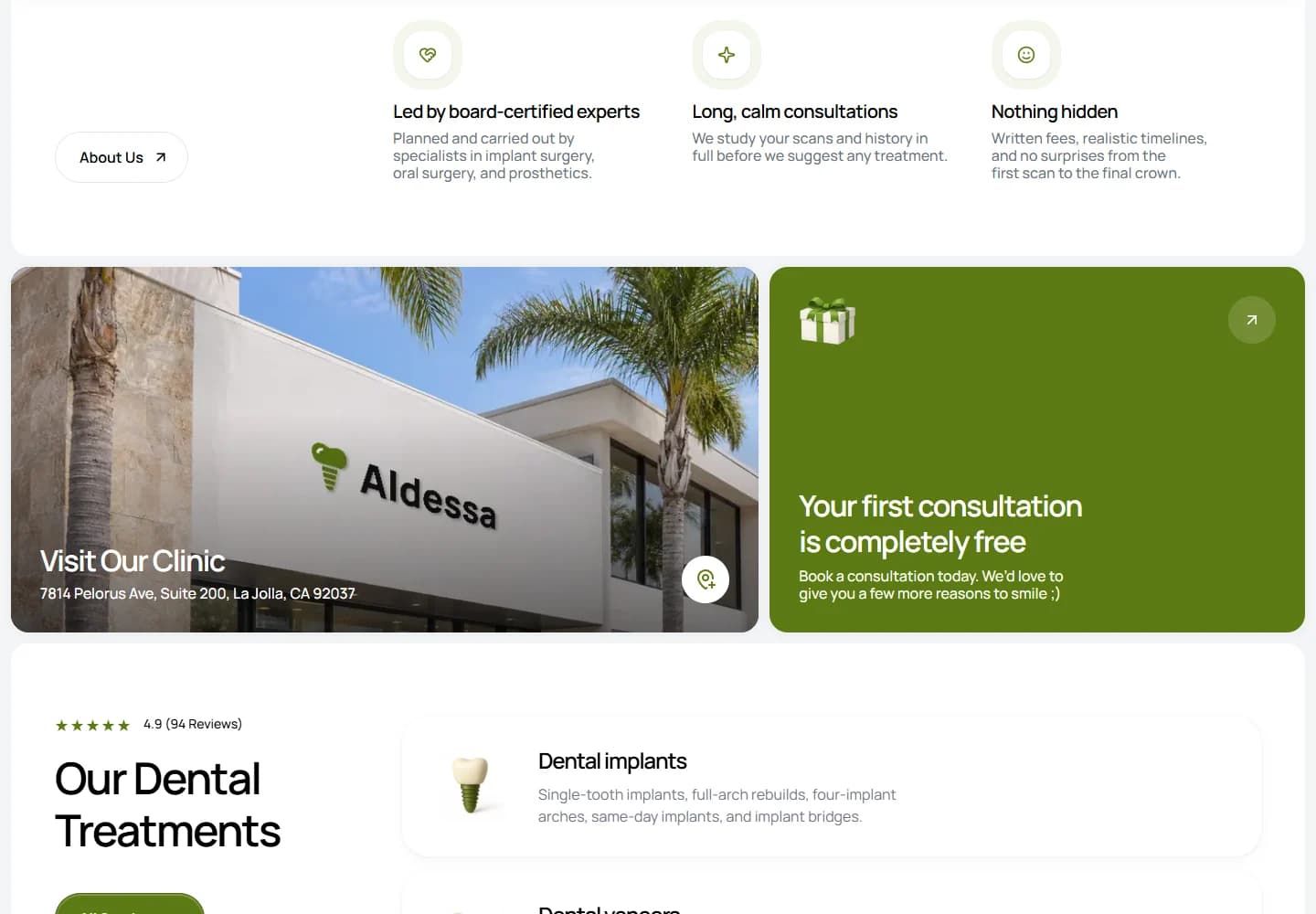
Desktop · A closer look at the content
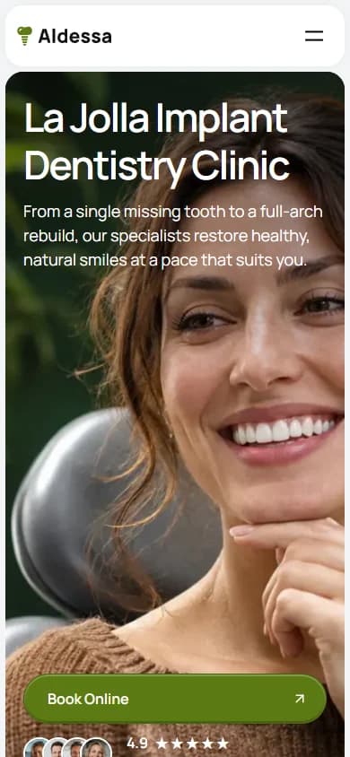
Mobile · The first impression
Your next website