A restrained consulting website with an editorial feel. Strong photography, clear service groups and a visible working process turn a broad advisory offer into a focused introduction.
Project scope
- Website design
- Advisory service structure
- Process presentation
- Consultation pathways
- Mobile layouts
The idea
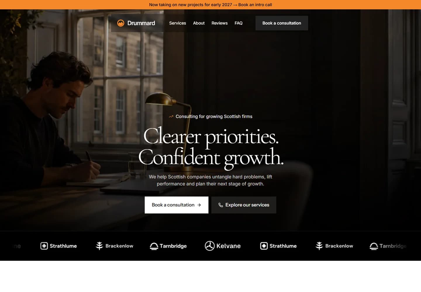
A consulting website needs to explain the kind of problem a firm can help with before it describes its methods. Drummard starts with priorities and growth, then introduces strategy, operations and financial planning. The aim of the presentation is to give a prospective enquiry enough context for a useful first conversation.
Design direction
Dark office photography and a centred serif headline set a thoughtful tone. A narrow orange strip gives the otherwise quiet layout a distinctive accent. The service sections use a more direct visual structure, keeping the page grounded once the introductory mood has been established.
The visitor journey
The hero lets visitors book a consultation or explore the services. Further down, the working process breaks an open-ended consulting engagement into recognisable stages, beginning with understanding and diagnosis. The page keeps the consultation route available while letting visitors explore the approach at their own pace.
Design review
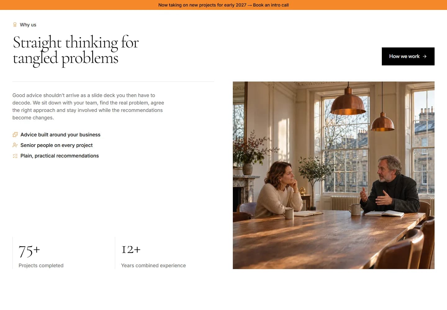
The contrast between the atmospheric opening and practical service content works well. It gives the brand personality without making the offer difficult to understand. Explaining the process is particularly valuable here because it helps a visitor picture what the first steps of an engagement might involve.
A closer look
Considered at every size.
Desktop · A closer look at the content

Mobile · The first impression
Your next website