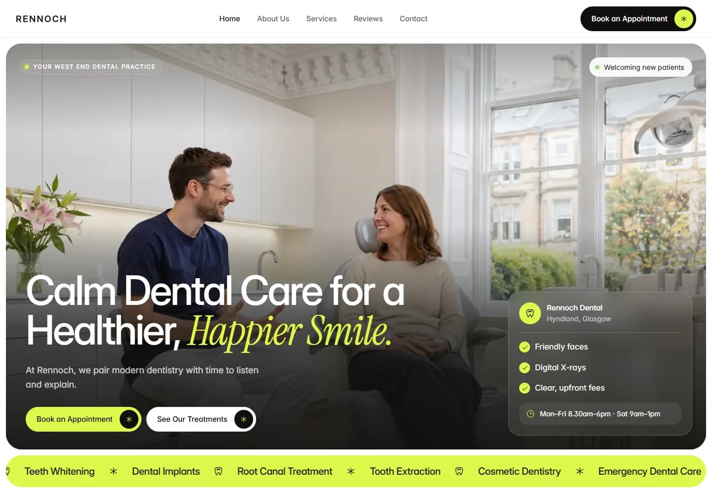
A modern dental website that feels calm without looking generic. Bright lime details, natural clinic photography and task-based navigation make everyday information easy to reach.
Project scope
- Website design
- Patient task navigation
- Treatment catalogue
- Practice information
- Appointment pathways
The idea
Not every visitor arrives at a dental website ready to book a treatment. Some need a check-up, some have a question, and others simply want directions. Rennoch makes those everyday tasks part of the design, alongside the larger treatment catalogue and the introduction to the practice.
Design direction
Natural clinic photography establishes a calm setting, while a vivid lime accent gives the brand a contemporary edge. A mix of clean sans-serif type and an expressive italic detail adds character to the hero. Dark overlays keep the copy readable without losing the sense of a bright, welcoming interior.
The visitor journey
A quick-choice section offers four direct routes: book a check-up, browse treatments, ask a question or find the practice. Treatment cards then separate routine care from options such as whitening and implants. Supporting practice information provides context for visitors comparing their options.
Design review
The task-based navigation is the standout feature. It acknowledges that a useful healthcare site needs to answer small practical questions as well as present services. The bold accent colour makes the main actions visible while the photography and spacing preserve a relaxed tone.
A closer look
Considered at every size.
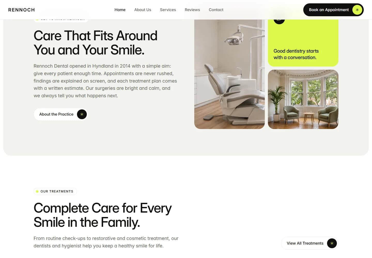
Desktop · A closer look at the content
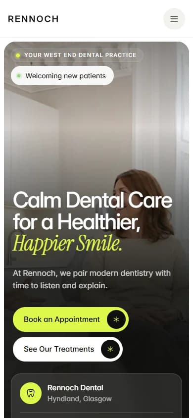
Mobile · The first impression
Your next website