A direct plumbing website with a strong local-service identity. Dark navy, red controls and a clear phone-first introduction lead into services, project examples and maintenance information.
Project scope
- Website design
- Phone-first contact routes
- Service catalogue
- Project presentation
- Mobile layouts
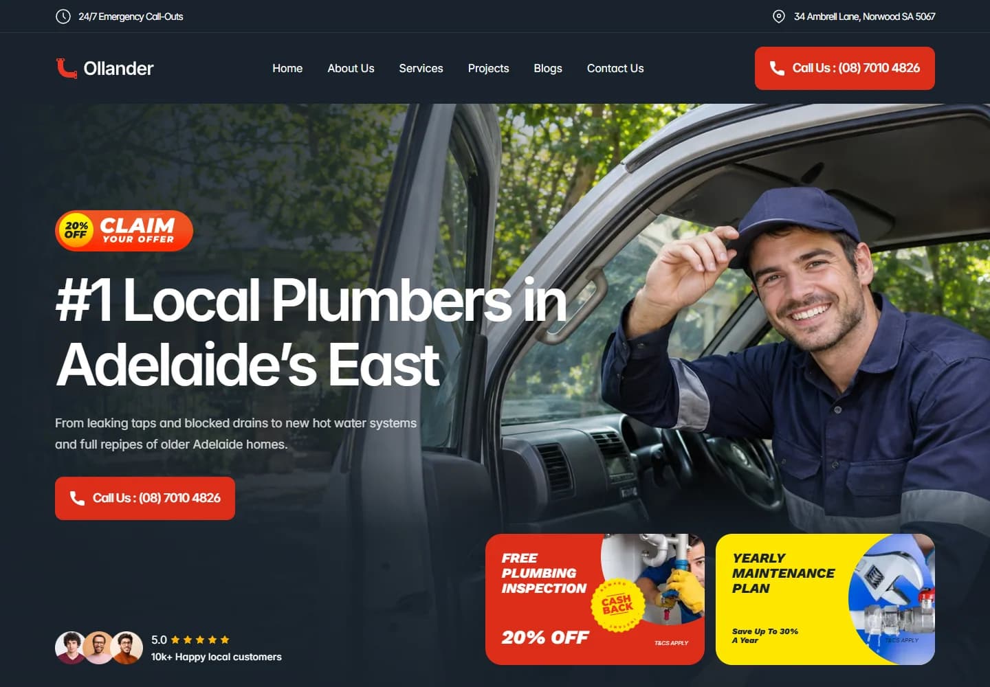
The idea
Ollander’s website is organised around a familiar local-service decision: can this business help with my job, and how do I reach them? The introduction makes the service and contact route prominent. The rest of the page expands into blocked drains, kitchen plumbing, pipe work and hot-water systems.
Design direction
Navy backgrounds and bright red calls to action give the page a strong contrast. The hero photograph shows a plumber at the van, creating a recognisable service setting. Smaller promotional cards introduce maintenance and inspection offers without replacing the main phone action.
The visitor journey
Visitors can call from the hero, request a quote or explore the service categories. Recent project entries show the kinds of jobs presented by the site, while article links provide another route into the content. Emergency information has a separate position at the top of the page.
Design review
The phone-first hierarchy suits the service well. A visitor who already knows they need help does not have to navigate through the catalogue first. For a less urgent job, the project and service sections provide a more considered route through the same site.
A closer look
Considered at every size.
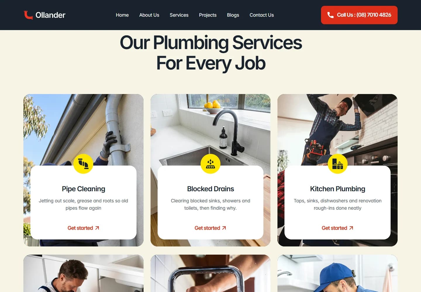
Desktop · A closer look at the content
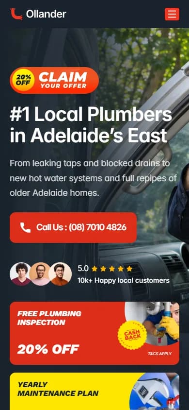
Mobile · The first impression
Your next website