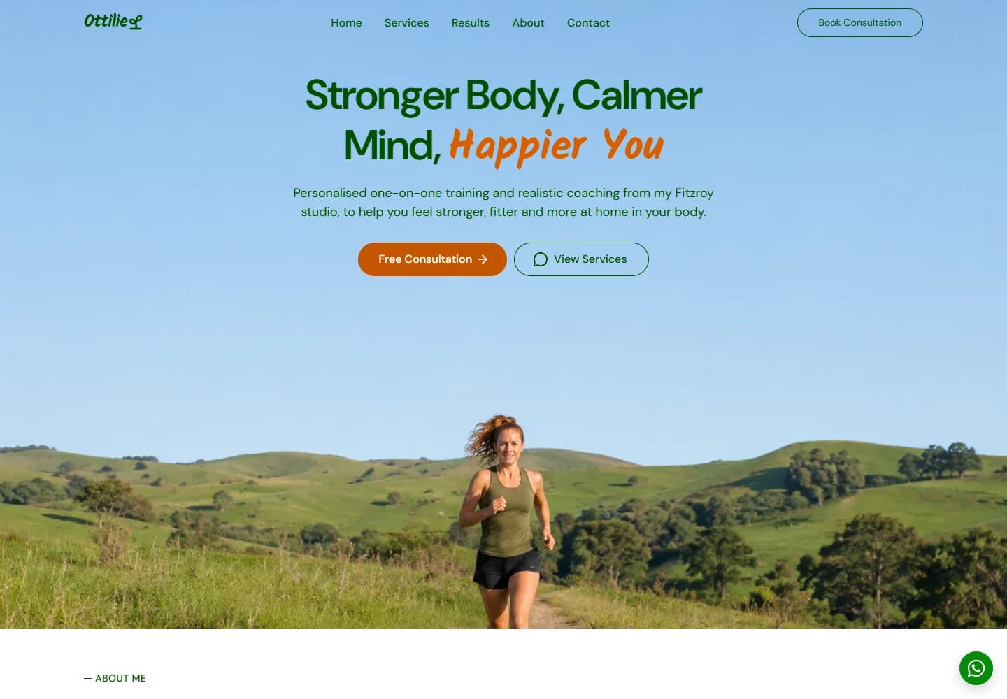
A personal-training website with an open, optimistic feel. Outdoor imagery, a conversational voice and clear coaching options make the introduction feel personal rather than intimidating.
Project scope
- Website design
- Personal brand presentation
- Coaching service layout
- Consultation pathways
- Mobile layouts
The idea
Personal training starts with a relationship, so this site makes room for the trainer’s voice as well as the services. Ottilie’s page introduces one-to-one sessions, online coaching and nutrition guidance through a message about everyday strength and wellbeing. The consultation route is presented as the beginning of a conversation.
Design direction
An open sky and green landscape give the hero a sense of space. Green type, orange actions and a handwritten-style accent keep the visual language upbeat. The photograph does not crowd the headline, allowing the introduction to feel relaxed even on a relatively simple layout.
The visitor journey
The page moves from the introduction into the trainer’s story, coaching options and the steps around getting started. Visitors can browse a service before choosing a consultation or session enquiry. A direct messaging option provides another visible contact route for someone with an initial question.
Design review
The open composition is a good match for the tone of the offer. It avoids making fitness feel like a hard sell, while still making the service choices easy to find. The strongest element is the consistency between the imagery, copy and personal contact routes.
A closer look
Considered at every size.
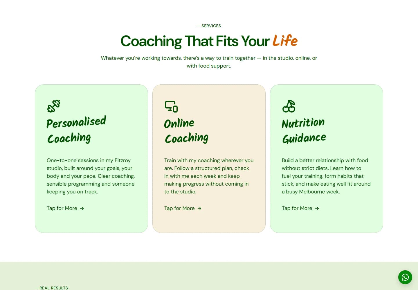
Desktop · A closer look at the content
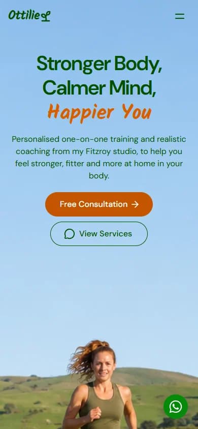
Mobile · The first impression
Your next website