A physiotherapy and chiropractic website with a clear, welcoming structure. Treatment information, care plans and practical articles sit behind a simple introduction to the clinic.
Project scope
- Website design
- Treatment navigation
- Care-plan presentation
- Article layout
- Appointment pathways
The idea
People looking for a clinic may know what is bothering them without knowing the name of a treatment. Wexcombe introduces the setting and the available care before presenting more detailed options. The site brings treatments, pricing information and educational content into one navigable structure.
Design direction
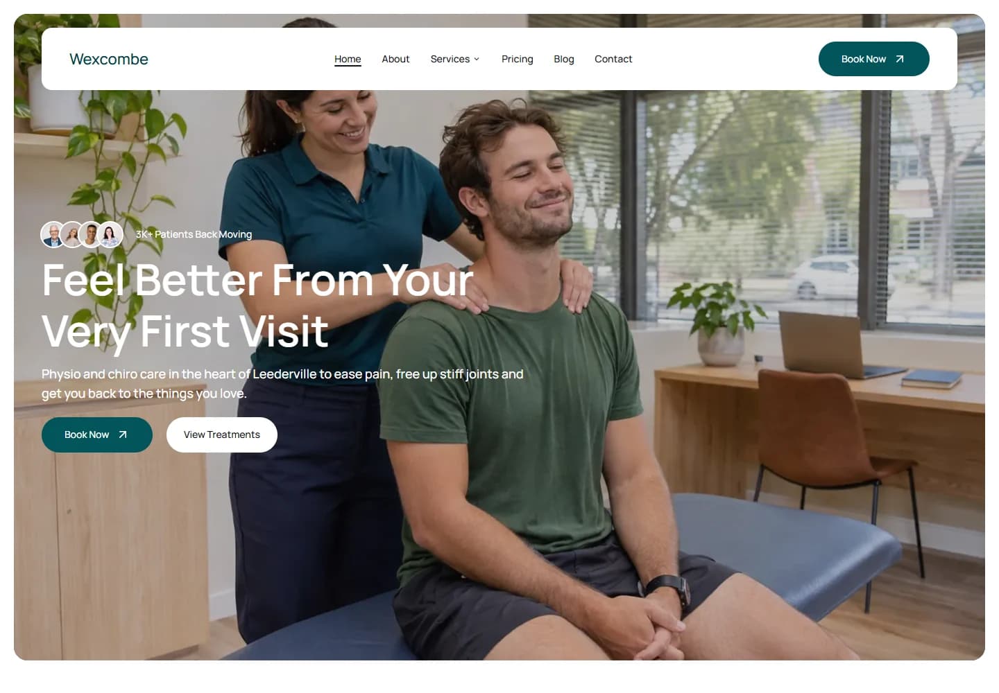
Teal controls and white navigation sit over a bright treatment-room photograph. The opening focuses on the interaction between a practitioner and a visitor, giving the site a human starting point. Clear cards and regular spacing carry the content through the longer service sections.
The visitor journey
Visitors can book from the hero or browse treatments first. The catalogue separates areas such as pain management, sports care, posture and rehabilitation. Care-plan information and articles about everyday movement provide further context before a visitor chooses an enquiry route.
Design review
The useful part of this design is its organisation. Treatments, practical information and contact options have distinct places, which helps a visitor explore without needing to read every section. The photography supports a welcoming tone while the layout gives the more detailed content enough structure.
A closer look
Considered at every size.

Desktop · A closer look at the content

Mobile · The first impression
Your next website