An editorial health website that makes a complex testing offer easier to explore. Natural photography, quiet typography and structured panel information create a calm route from curiosity to booking.
Project scope
- Website design
- Testing catalogue layout
- Plan comparison
- Practitioner profiles
- Mobile layouts
The idea
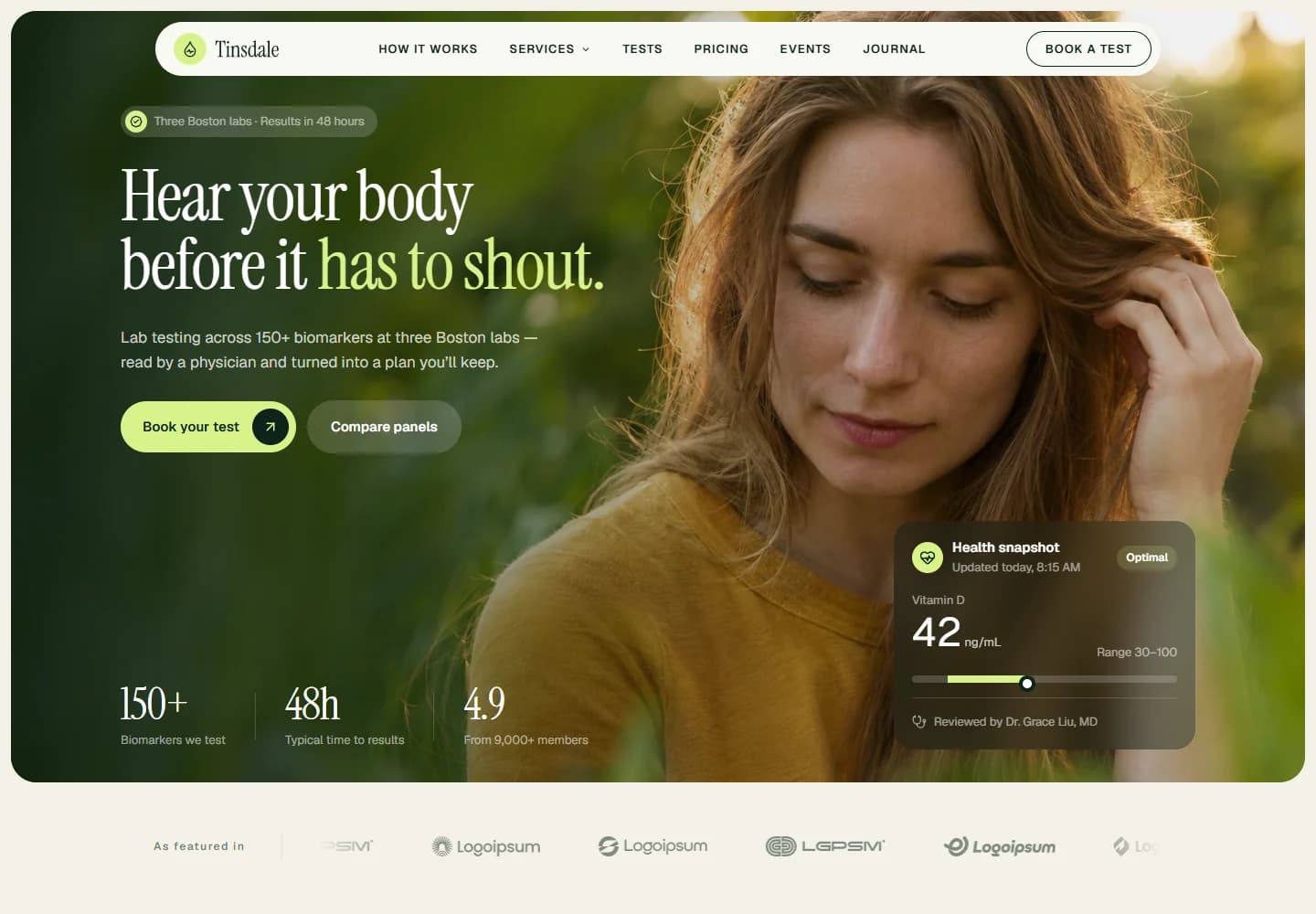
Health testing can quickly become a wall of technical terms. Tinsdale takes a more approachable route: begin with a familiar feeling, then explain the available tests and how the service works. The project explores how a health brand can feel considered and readable while still making room for detailed information.
Design direction
Forest greens and warm neutrals sit alongside an expressive serif headline. The portrait-led hero keeps the opening human, while a compact sample results card introduces the data side of the service. This contrast carries through the page: soft imagery around structured, easily scanned content.
The visitor journey
Two opening choices let visitors book a test or compare panels. The catalogue separates full-body testing from more specific topics such as hormones, thyroid function and vitamin levels. Practitioner profiles and process information provide another route for visitors who want to understand the service before choosing a panel.
Design review
The visual hierarchy is the key to this project. The headline invites a closer look, the cards organise the choices, and the booking controls stay distinct. It demonstrates a useful approach to information-heavy health websites: make the next piece of information easy to find without trying to put everything in the hero.
A closer look
Considered at every size.
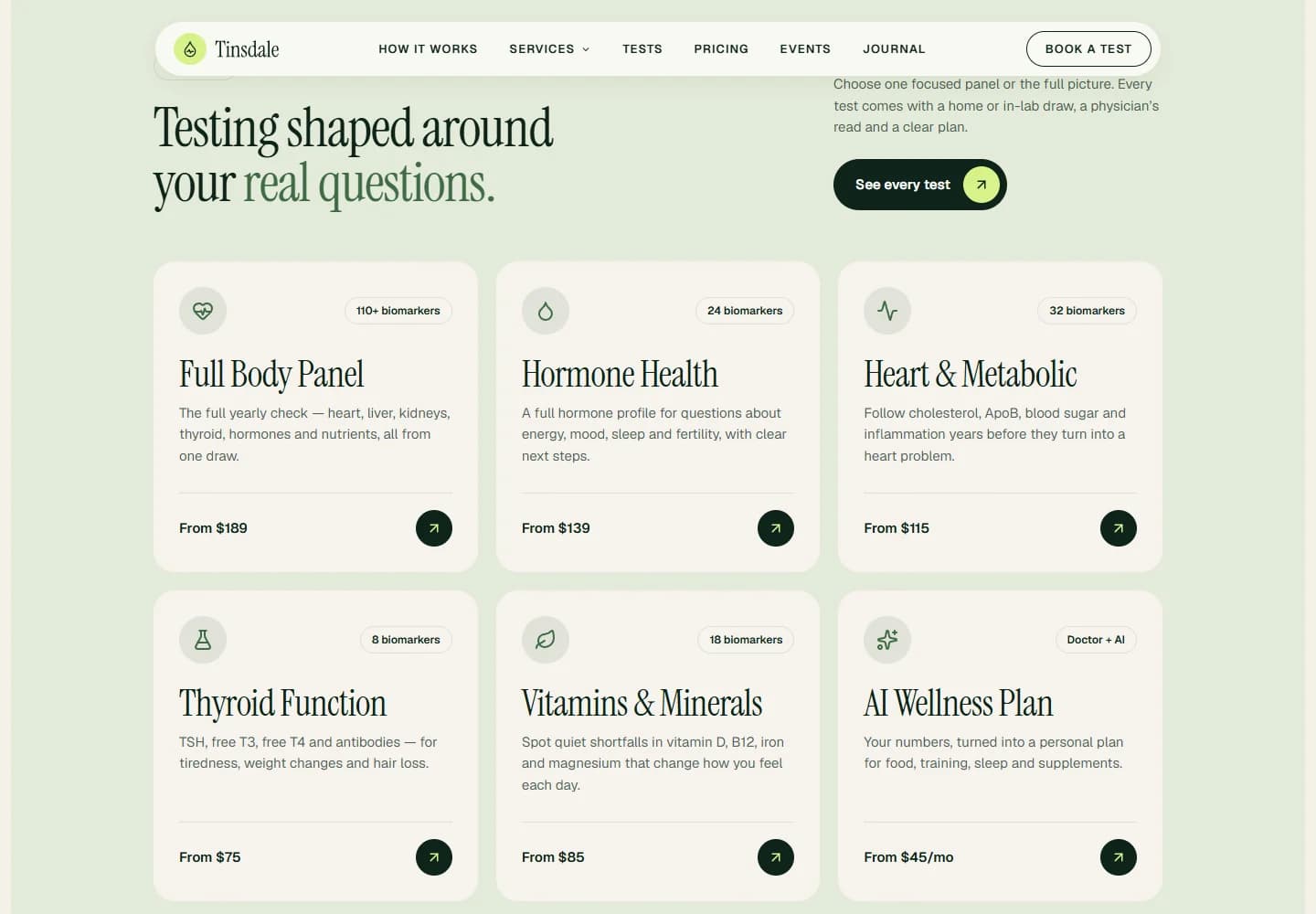
Desktop · A closer look at the content
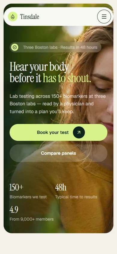
Mobile · The first impression
Your next website