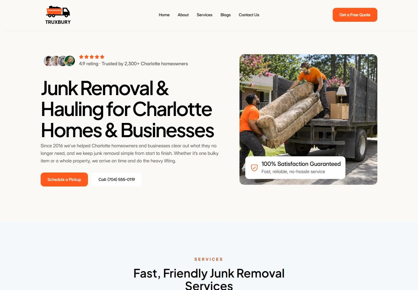
An approachable junk-removal website with clear service choices. A simple split hero, energetic orange accents and practical content help visitors find the right pickup route.
Project scope
- Website design
- Service categorisation
- Pickup enquiry pathways
- Article presentation
- Mobile layouts
The idea
Someone clearing a garage has different questions from a business arranging an office cleanout. Truxbury uses clear service categories to make those different needs easy to recognise. The opening copy describes the offer plainly, with a pickup action and phone option close to the headline.
Design direction
The split hero leaves room for a substantial headline on one side and an image of the work on the other. Orange accents connect the truck branding with the buttons, while the light background keeps the layout open. The overall feel is practical and friendly rather than heavy or industrial.
The visitor journey
Visitors can go straight to a pickup enquiry or browse categories for household junk, furniture, yard waste, construction debris and larger cleanouts. Supporting articles offer another entry point for people planning a job. The service structure lets the site speak to homeowners and businesses without mixing all their needs into one paragraph.
Design review
The clear category names are the strongest part of the experience. They reduce the effort of working out whether the service fits a particular job. The visual identity supports that clarity: bold enough to be memorable, but simple enough to keep attention on the enquiry.
A closer look
Considered at every size.
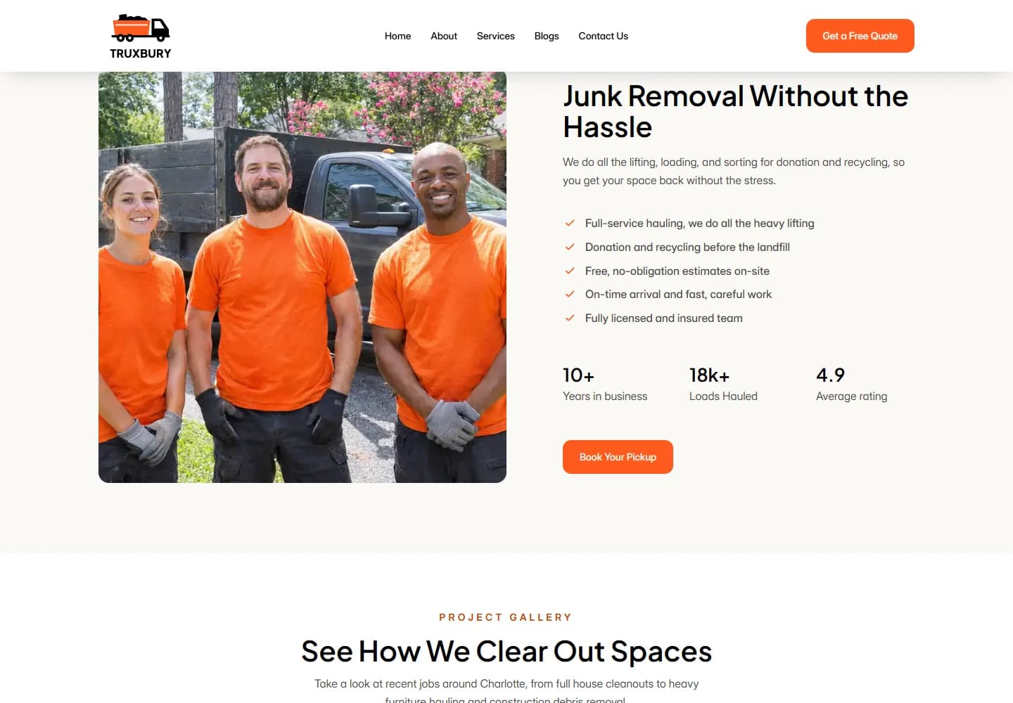
Desktop · A closer look at the content
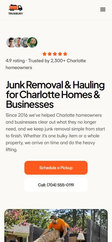
Mobile · The first impression
Your next website