A welcoming veterinary website with pet photography at its heart. A deep teal identity, warm orange actions and clear care categories make the page feel friendly and easy to explore.
Project scope
- Website design
- Pet-care service layout
- Practice introduction
- Visit process
- Appointment pathways
The idea
Whiskerton brings everyday veterinary care and wider pet services together in one introduction. The site gives owners a place to explore check-ups, dental care, grooming and nutrition support while keeping the visit route easy to find. Its tone is deliberately warm, with pets at the centre of the visual story.
Design direction
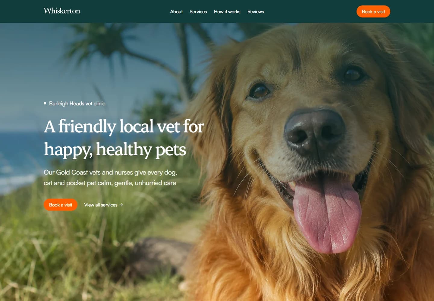
A close-up dog photograph fills the hero, balanced by a compact headline and two simple actions. Deep teal navigation and orange buttons create a recognisable palette. Below the opening, image and text sections give the practice room to introduce its approach before the service catalogue.
The visitor journey
Visitors can book immediately or browse the care options first. The services are separated into everyday categories, supported by an explanation of the visit process and practical contact information. The structure lets someone researching routine care take a different path from someone ready to make an appointment.
Design review
The pet-led imagery establishes the tone in a single glance. The design then keeps its promise by staying simple and welcoming throughout the page. Clear service groupings are what make that friendliness useful: visitors can quickly find the kind of care they came to ask about.
A closer look
Considered at every size.
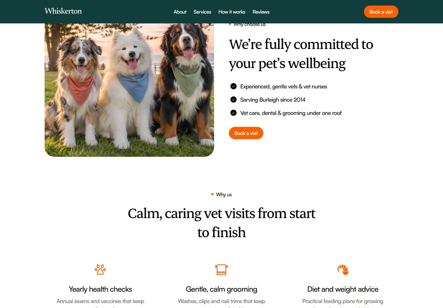
Desktop · A closer look at the content
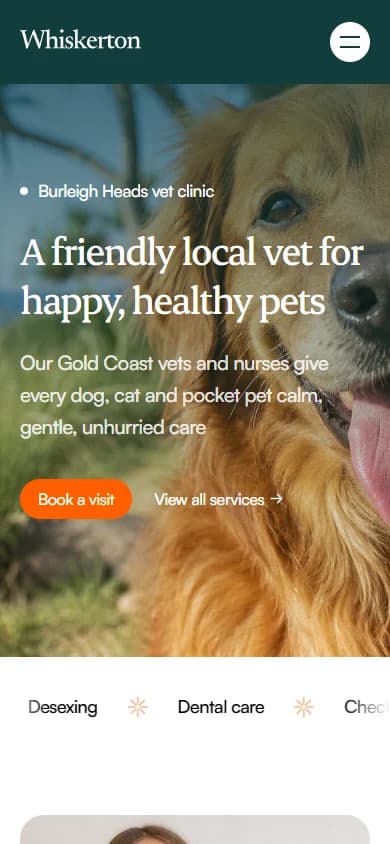
Mobile · The first impression
Your next website